Generation Press — Brand refresh
We are very proud of our brand designed by long-time collaborator and friends Build. They have been on our journey since 2007 (Build stationery and a couple of Christmas cards later) with further work including the anonymous collaboration ‘Not For Commercial Use’ in 2008, a new brand for Generation Press in 2010 that featured a bespoke, coloured stock named Colorplan Barry, and in 2011 a campaign celebrating the new B2 Komori printing press.
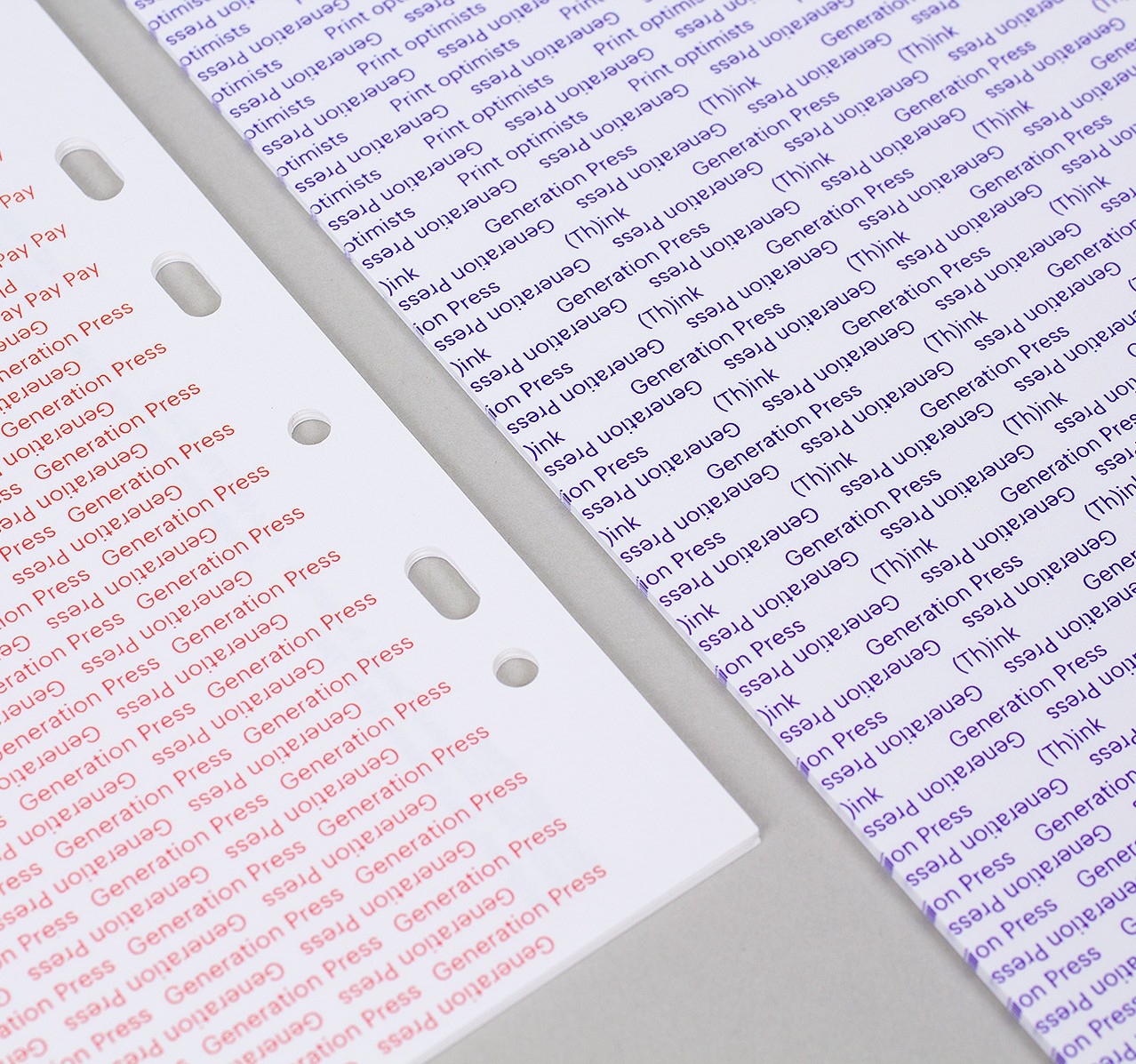
For the refresh of our brand we came to Michael at Build with a completely blank canvas. It had to show the progression of Generation Press, but retain our personality. The result: a minimal, stripped back identity central to which is ‘Poynings Stencil’, a bespoke typeface designed by Colophon Foundry under direction from Build. A full stationery set was printed and produced on carefully selected stocks using our full print arsenal to create something special that showcases our abilities and our personality.

Over the time we have worked with Build, we have come to truly appreciate the value of collaboration, as with many other clients we work with. Collaboration is key in all elements of our work, and the same was true with our website. Which is why we assembled a ‘dream team’ to bring Generation Press to life in the digital world.
It is hard to define who played which role in the creation of our new website, apart from that, if there is anything that you think is particularly genius then that was my idea ;) Thanks guys, a truly pleasurable experience.
Dream team
Creative direction: Michael C Place, Build
Design: Delta Papa
Website: Tom van de Velde
Copywriting / inspiration: Nick Asbury, Asbury & Asbury
Photography: György Kőrössy
Type design: Colophon Foundry